 UI/UX case study
Waremp.
Warehouse space, booked and managed from one phone.
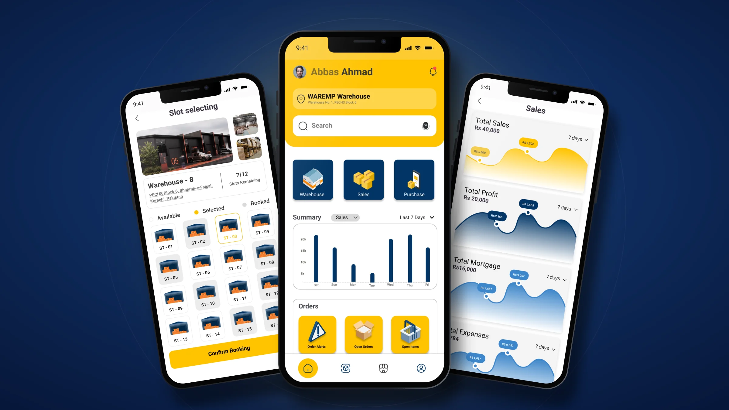
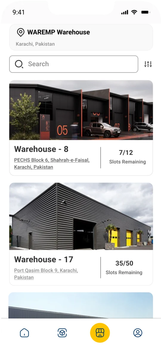
One app to find, book and run warehouse space.
The brief: bring warehouse booking, transport and stock management into a single mobile app. I designed the brand first, then every screen of the app, from the splash to the sales dashboard.
- Role
- Brand & UI/UX designer
- Platform
- iOS app
- Booking flow
- 6 steps
- Tools
- Figma
- Screens
- 22
- Deliverables
- Logo, design system, app UI
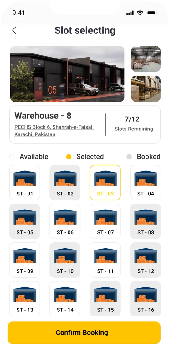
A grid of every bay in the warehouse, marked available, selected or booked.
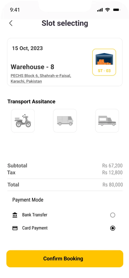
Bike, van or truck pickup added to the same booking.
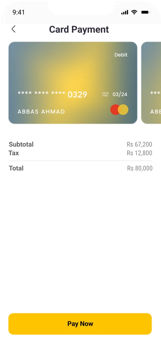
Card or bank transfer, with the total broken down before you pay.
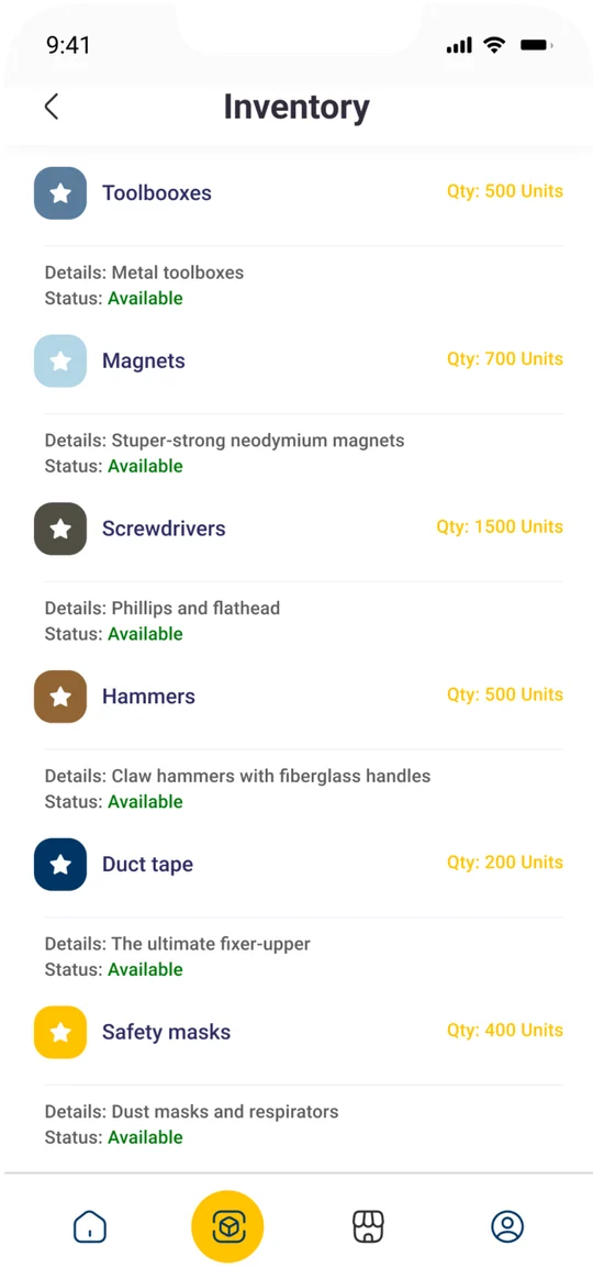
Stock by item with quantity and status at a glance.
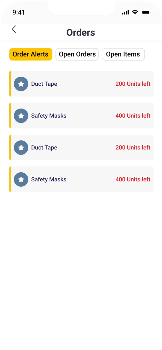
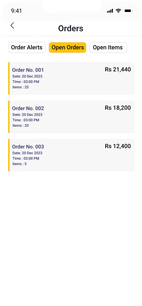
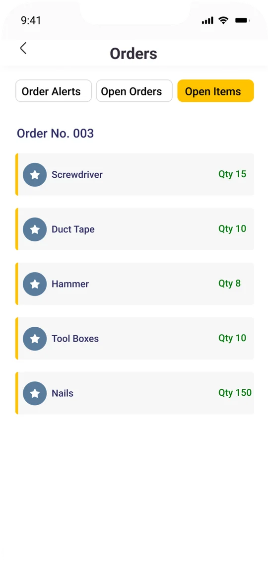
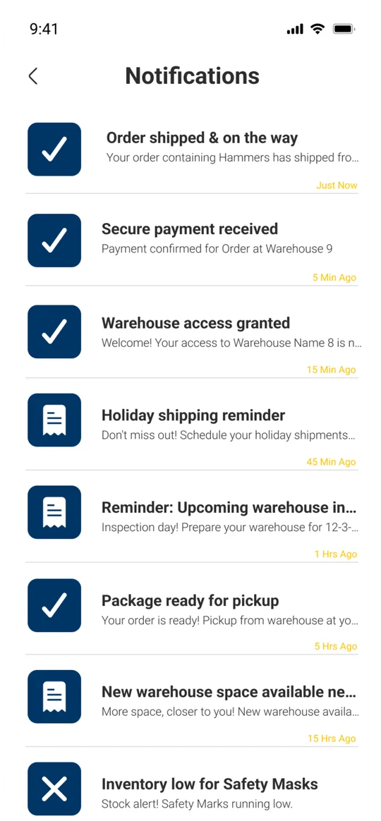
Alerts, open orders and open items in three tabs.
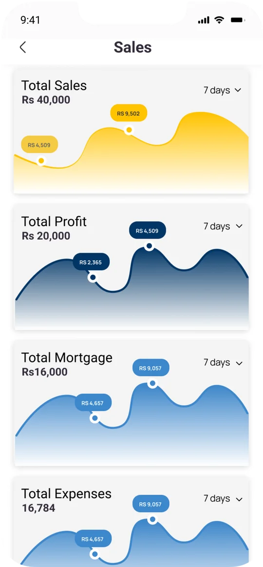
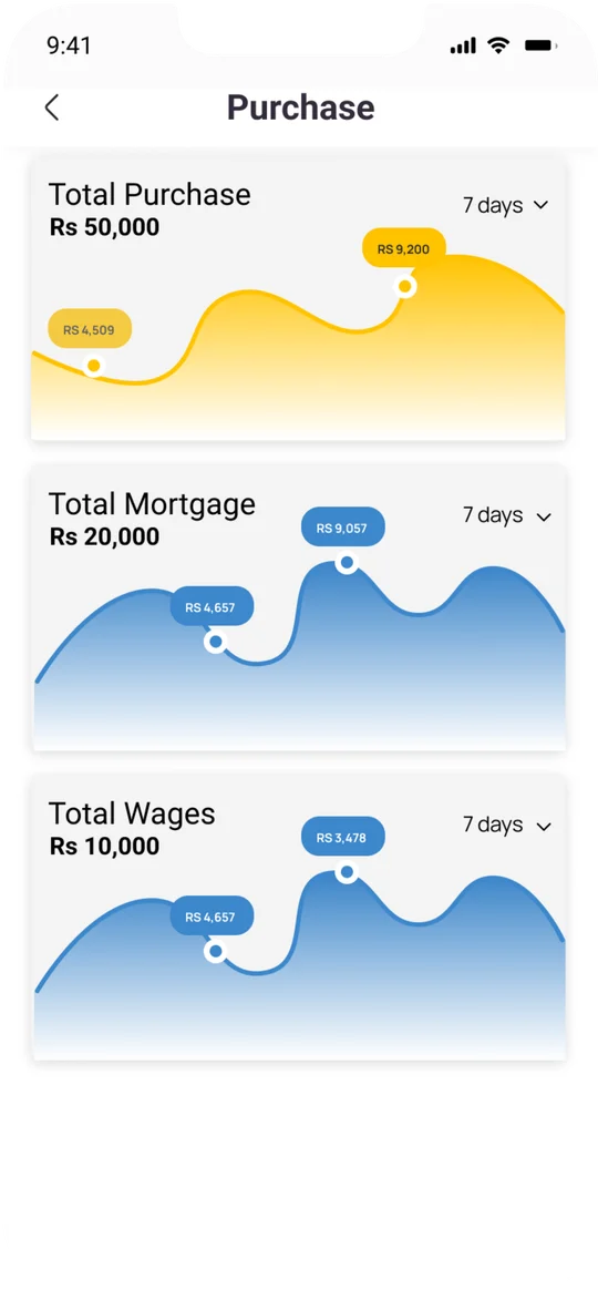
Seven-day charts for sales, profit, purchases and expenses.
From launch to booked in six steps.

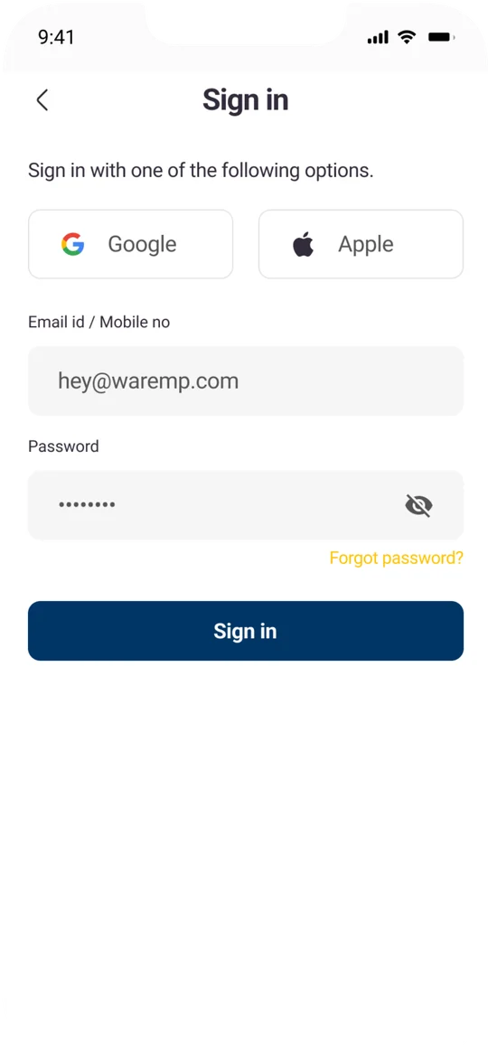
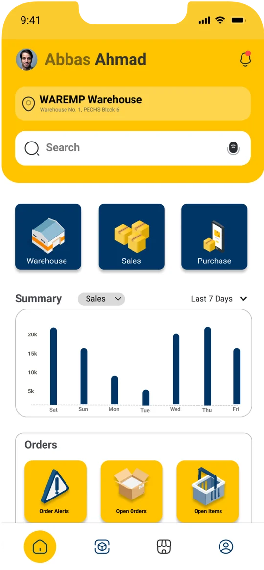

Navy for trust. Yellow for every action.
RGB 255 195 0
RGB 0 53 102
RGB 0 8 20
RGB 255 255 255
ABCDEFGHIJKLMNOPQRSTUVWXYZ abcdefghijklmnopqrstuvwxyz 0123456789
Pick a bay, add transport, pay. Every primary action lives in the same yellow bar.
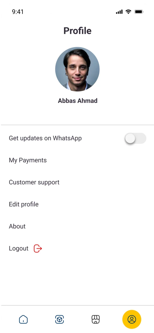
22 screens, one system.
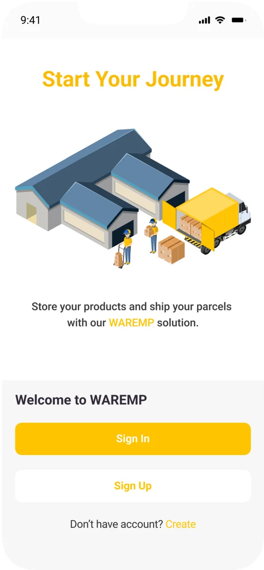
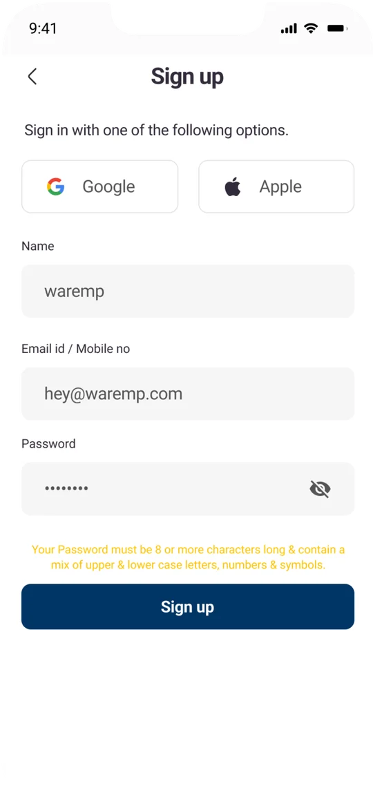
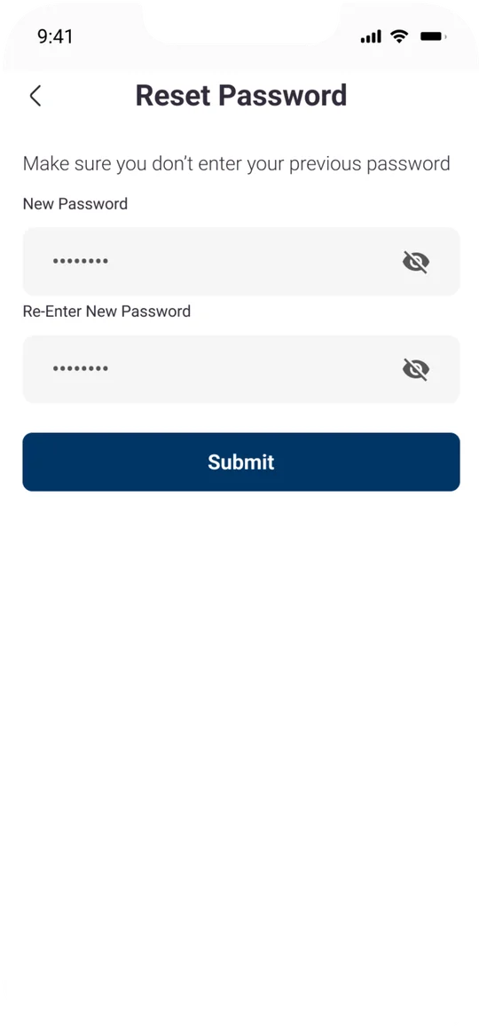
Onboarding, accounts, booking and the daily tools, all built from the same components.



A mark built to work at app-icon size.
Thanks for scrolling.
Brand identity & UI/UX design by Emaan Ahmad