Emaan Ahmad — Brand Identity, Packaging & Photography Designer
{{ slotsText }}Booking
Hello!

I'm
Emaan

I design brand experiences
that connect & convert.

Dubai-based graphic & web designer building brand identities, packaging and social systems for founders who want to be noticed.

Emaan Ahmad
Design is
my superpower
Brand IdentityPackaging DesignSocial MediaWeb & Digital Brand IdentityPackaging DesignSocial MediaWeb & Digital
Trusted by brands & founders
Baoo Jee PMS Hummal Elań Cloud Hub Solutions Butterly Cookies Oriental Kopitiam Perfect Planner SchroevenXL De Musk
5
Years Freelancing
20+
Projects Delivered
2
Years On-Site
UAE
Based, working worldwide
Tools I work in
{{ t.name }} logo {{ t.ab }} {{ t.name }}
Featured Work

Three brands,
built end to end.

All projects →
Kind words

What clients say

Hover to pause
{{ q.text }}
{{ q.ab }} {{ q.name }}{{ q.brand }}
Photography

The habit
of looking

A camera is how I learn to see a place. Ninety frames from Dubai and Pakistan, and the practice that quietly feeds all the design work.

Faisal Mosque after rain Chevrons Orange hour Red umbrella Portrait Moon through branches Birds around a tower Cyclist in the rain
See the photographs →

Services
that ship.

From first sketch to final export, I handle the whole visual system so your brand shows up sharp everywhere.

01

Brand Identity

Logos, colour systems and guidelines with one confident voice.

02

Packaging

Shelf-ready packaging that earns the second glance.

03

Social Media Design

Static and animated content built for restless feeds.

See all services →
About Me

Hello, I'm Emaan.

I'm a graphic designer working across brand identity, packaging, social media and digital graphics. Five years freelance and two years on-site, which means I've built brands from a blank page and also shipped inside a team on someone else's deadline.

Most of my work starts with a conversation rather than a moodboard. I want to know who the brand is talking to and what it needs to be believed, then design the system that makes that happen everywhere: on shelf, in print, on a phone.

Alongside client work I run self-initiated projects, usually photography-led, where the research and the writing are mine as much as the design. Those are the pieces that keep the craft honest.

The camera comes everywhere. Most of what I know about colour, light and cropping I learned on the street between Dubai and Pakistan, not in a software panel. A selection of those photographs is here.

Adobe
Photoshop logo Photoshop Illustrator logo Illustrator After Effects logo After Effects Premiere Pro logo Premiere Pro Lightroom logo Lightroom InDesign logo InDesign
Also
Figma logo Figma Canva logo Canva
Process

How I work

01

Listen

A call about the business, the audience and what the design actually has to do.

02

Direction

Two or three routes, each with a reason behind it, so the choice is a decision and not a preference.

03

Build

The chosen route taken all the way out, with revisions where they matter.

04

Hand over

Every file, print-ready and web-ready, organised so you can find it in six months.

{{ wlbCap }}
{{ wlbCap }} {{ wlbMeta }}
Client & Brand Work

The Portfolio

Identity systems, packaging, social campaigns and digital graphics, built for brands in fashion, tech, food and retail.

← Back to work Qissah Souk · قصة سوق

Editorial & Identity · Self-initiated

Qissah Souk

A photographic book and identity system for the parts of Dubai's old souks that don't make the postcard.

Role

Concept, art direction, photography, editorial design, identity & copy

Deliverables

28-page book, poster series, collateral, site, exhibition

Location

Deira & Bur Dubai, UAE

Year

2025 · Exhibited, Alserkal Avenue

Qissah Souk book cover
01

Context

The souk is photographed constantly and understood rarely.

Dubai's historic markets, the Gold Souk in Deira, the Spice Souk on the creek, the Textile Souk in Bur Dubai, are among the most photographed places in the city. Almost all of that imagery is the same image: saturated spice cones, a wide alley, a tourist mid-frame. The souk arrives flattened into a backdrop.

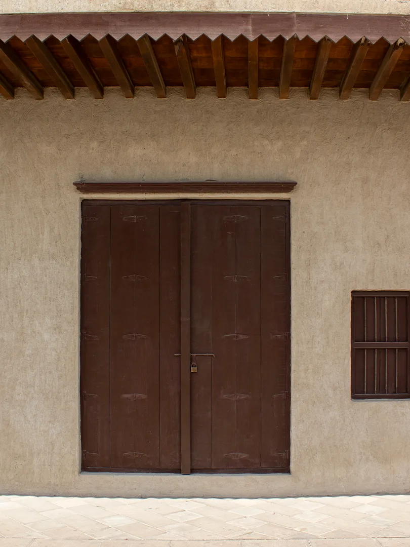
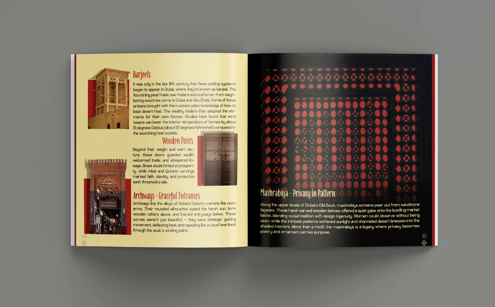
What that imagery leaves out is everything that makes the place legible: the barjeel that cools an interior by ten degrees, the mashrabiya that lets you look without being seen, the brass studs on a door that once announced a family's standing. The souk's story is architectural and social before it is scenic.

Qissah Souk, qissah meaning story, began as a self-initiated project to spend real time in those alleys, learn what the details meant, and build a record that reads as narrative rather than gallery. No client, no brief, no deadline other than the one I set.

02

Three decisions that set the project

Walk first,
shoot second

Every shoot day started without the camera out. Time spent in the alleys, talking to vendors, tracing routes, noticing when light reaches the ground, decided what was worth photographing. The frames came from the walking, not the other way round.

Detail carries
the story

Wide establishing shots were cut early. They say market and nothing else. The edit favours the close read: lattice, hinge, stud, thread. Each detail could be annotated, and annotation is what turns pictures into an archive.

Warm, not
nostalgic

Heritage work slides easily into sepia. The palette answers the place instead: the crimson of shop awnings, the sand of coral-stone walls, the gold of the Deira windows, sourced from the photographs themselves and used at full strength.

03

Fieldwork & photography

Four visits, three souks, one rule: photograph what you can explain.

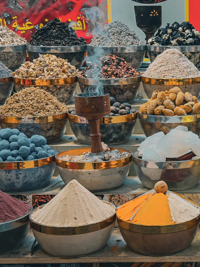
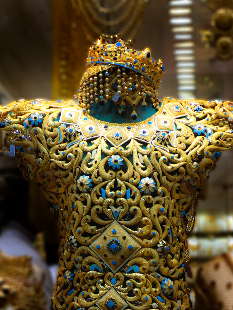
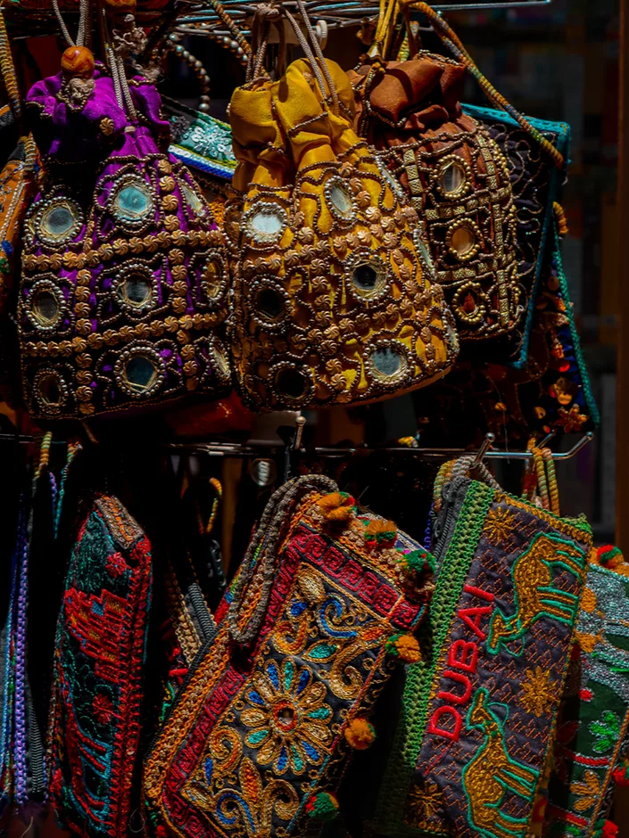
Shooting ran across separate visits at different hours: the Gold Souk after dark when the windows do the lighting for you, the Spice Souk in the late morning when the covered alley goes soft, Bur Dubai's textile arcades in the flat mid-afternoon that keeps colour honest.

Between visits the research caught up with the images: what a barjeel actually does, why archways repeat, how a mashrabiya negotiates privacy. Anything I couldn't write a caption for came out of the selects. The final edit ran to roughly forty frames.

Spice Souk stall, Deira
Spice Souk, Deira · open bowls, late morning
Bridal gold set in a Deira shop window
Gold Souk · bridal set, shop window
Embroidered bags on a rack, Bur Dubai
Textile Souk, Bur Dubai · mirrorwork
Coral-stone wall and wooden door, Al Fahidi
Al Fahidi · door, wall, roof beams
04

The system

One wordmark, four colours, one geometric motif.

The identity had to hold a 28-page book, a poster series, small print, a site and a physical stand without repeating itself. It is deliberately narrow: a single display face carries all voice, and everything else stays quiet enough to sit under photography.

Qissah Souk

Wordmark

A latin display face with the stroke logic of Arabic calligraphy: swelling entry strokes, a tapered terminal on the Q. It reads as English to a visitor and gestures at Arabic to a local. Set once, large, never locked to a container.

Palette

#9E1B1E  AWNING CRIMSON
#F3E4B4  CORAL SAND
#C08A2E  DEIRA GOLD
#1A1310  ALLEY INK

Motif

A diamond lattice lifted from the mashrabiya screens, redrawn on a strict grid. It runs as a border on small print, a low-contrast field on flat colour, and a screen-print texture on the stand.

05

The book

28 pages, square format, four movements.

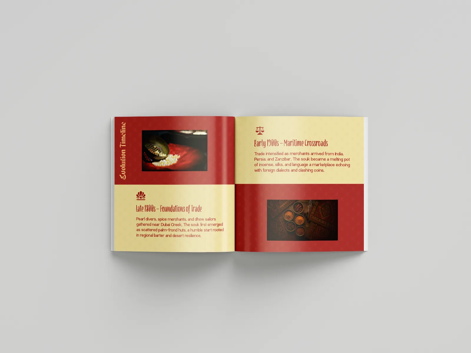
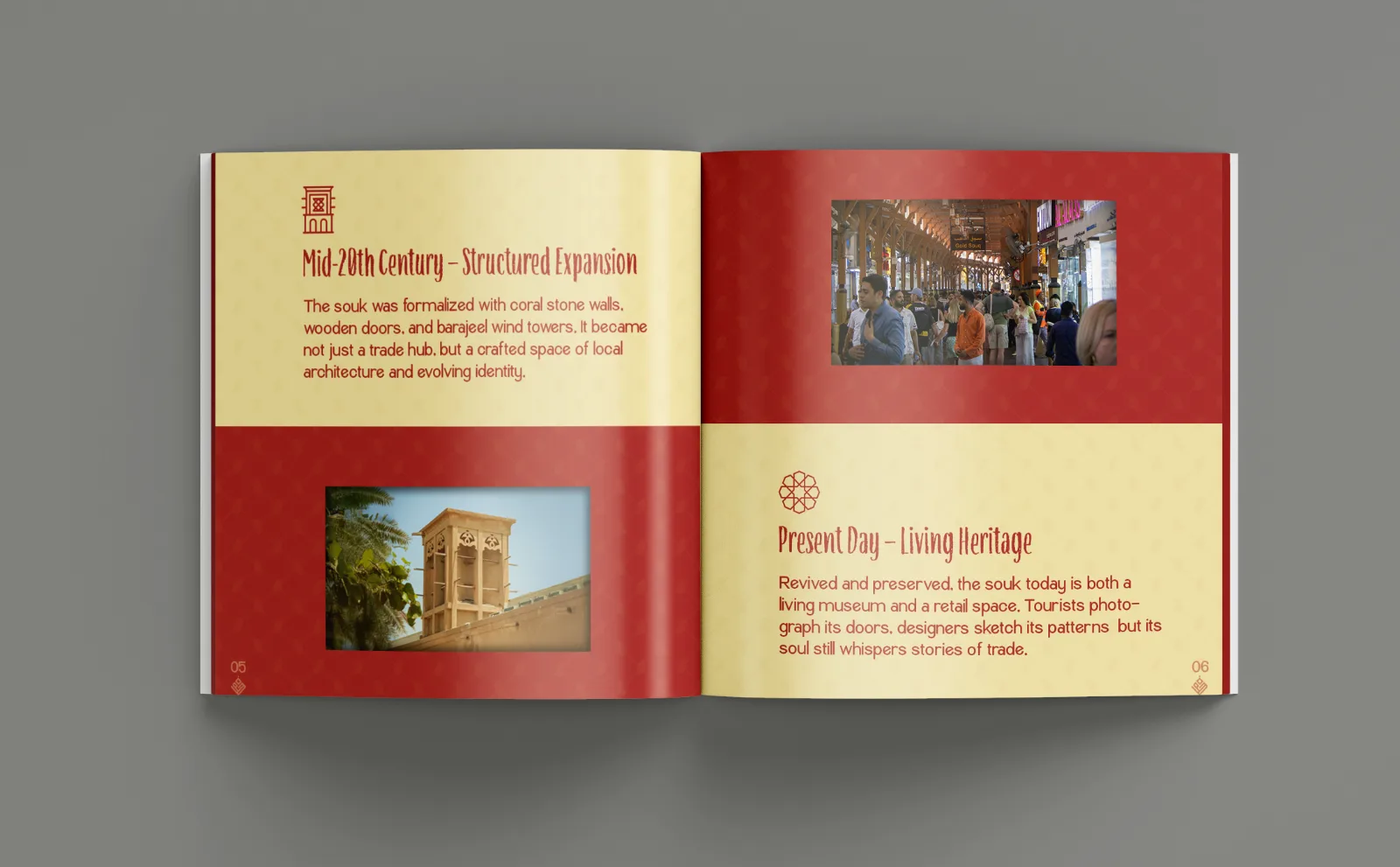
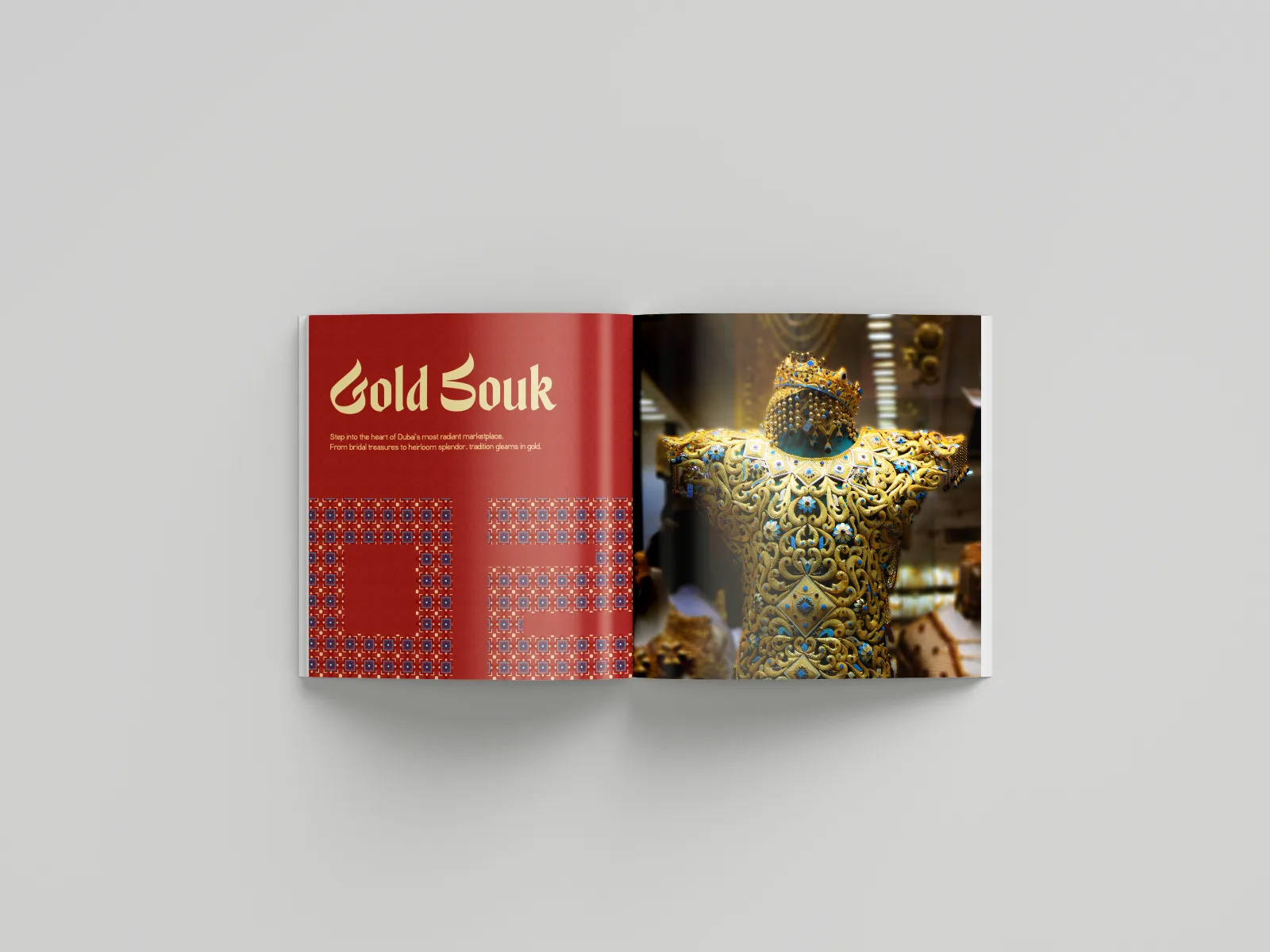
The square trim was chosen to give architecture and detail the same footprint, so no crop is privileged. The book opens with the souk's timeline, moves through a chapter of architectural elements, then gives each souk, Gold, Spice and Textile, its own colour-led section.

Spreads alternate between three states: full-bleed photograph, flat colour with type, and annotated detail. That rhythm is the whole editorial argument. Look, read, look again.

Timeline spread
01 · Timeline of the souk
Timeline spread, mid-century to present day
02 · Mid-century to present day
Architectural elements spread
03 · Annotated elements: barjeel, wooden doors, archways, mashrabiya
Gold Souk chapter
04 · Gold Souk
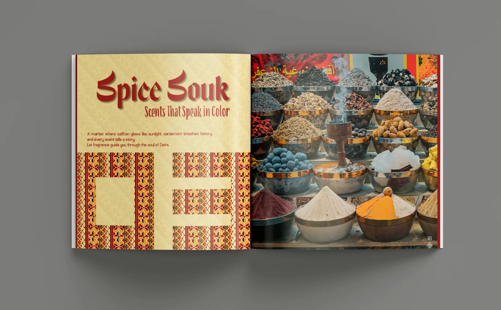
Spice Souk chapter opener
05 · Spice Souk
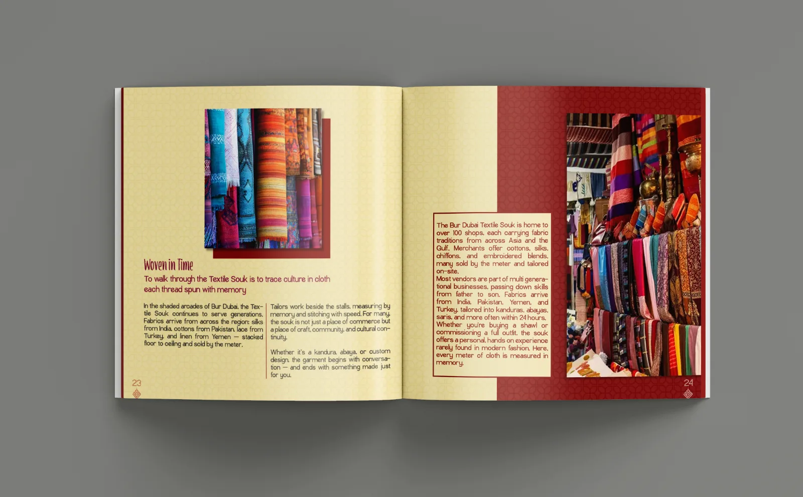
Textile Souk spread, Woven in Time
06 · Textile Souk: woven in time
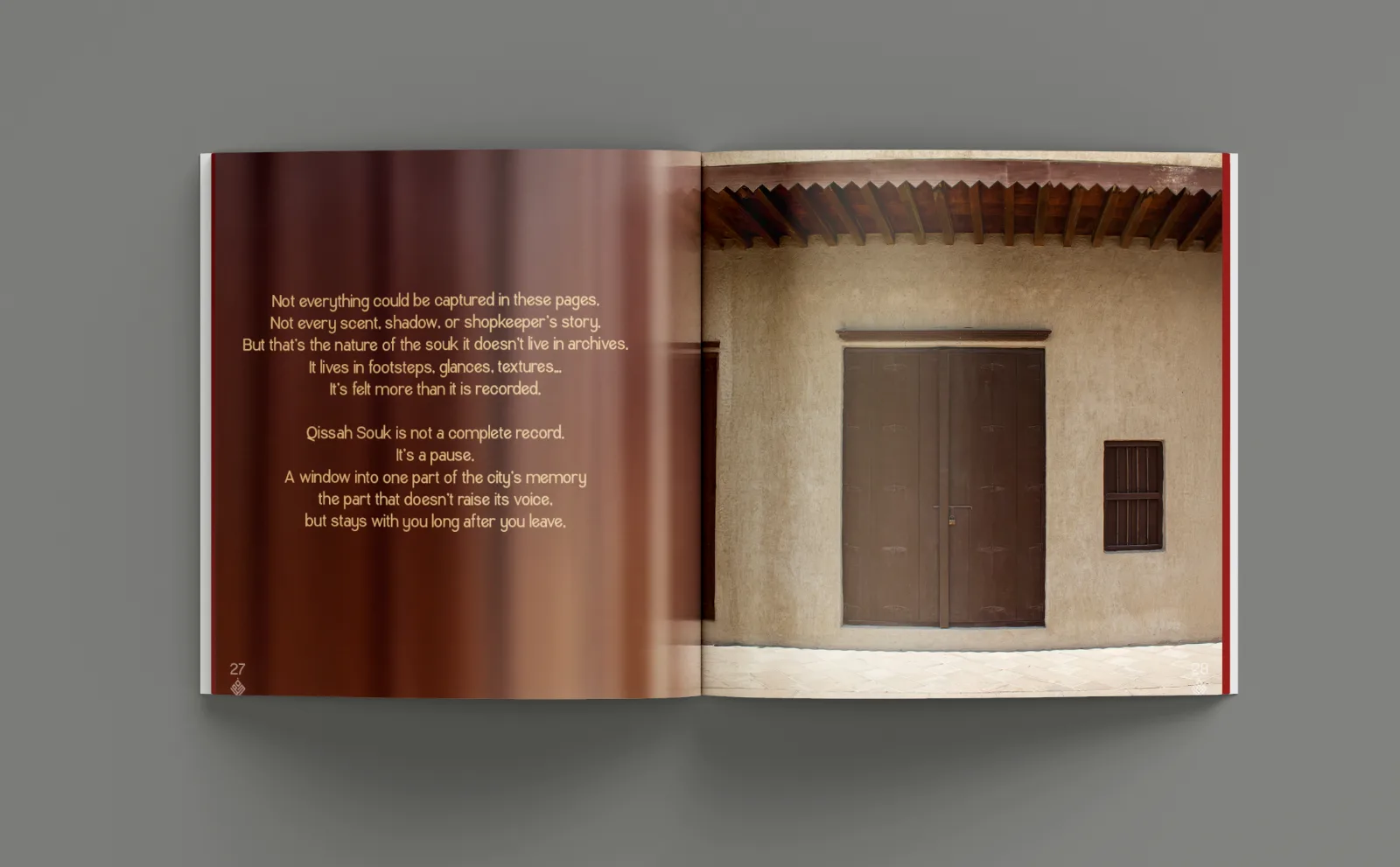
Closing spread
07 · Closing note

Qissah Souk is not a complete record. It is a pause, a window into the part of the city's memory that doesn't raise its voice.

Closing page, Qissah Souk

06

Extending the system

A book needs a way of arriving.

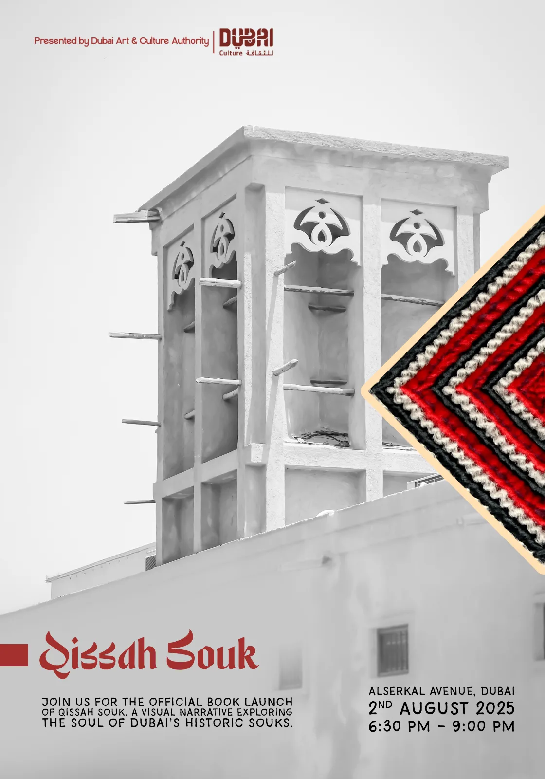
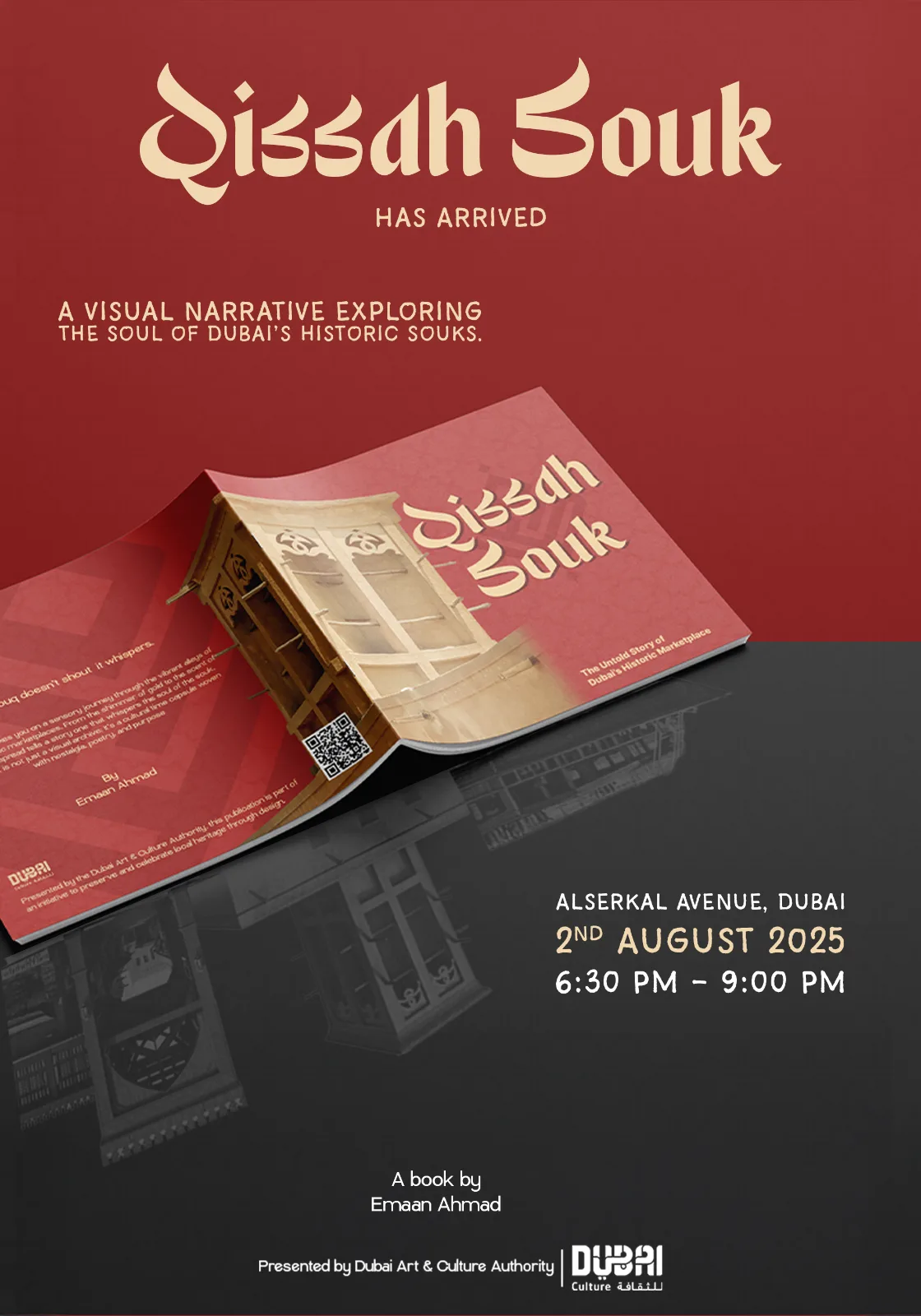
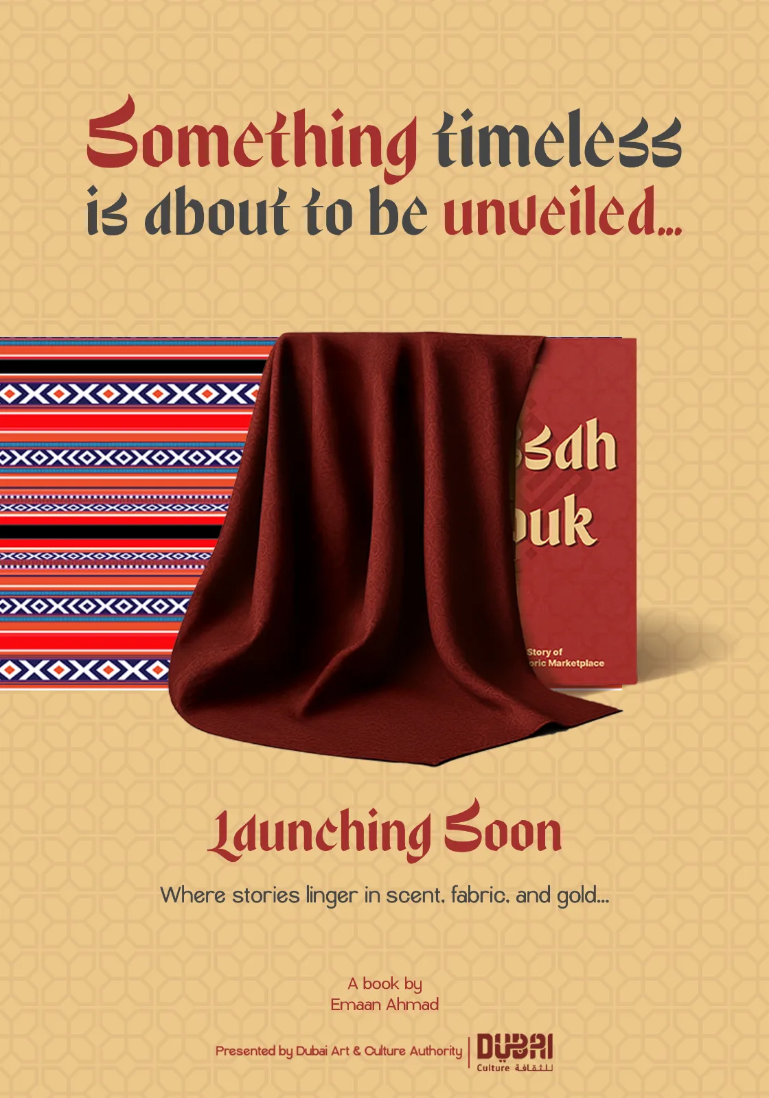
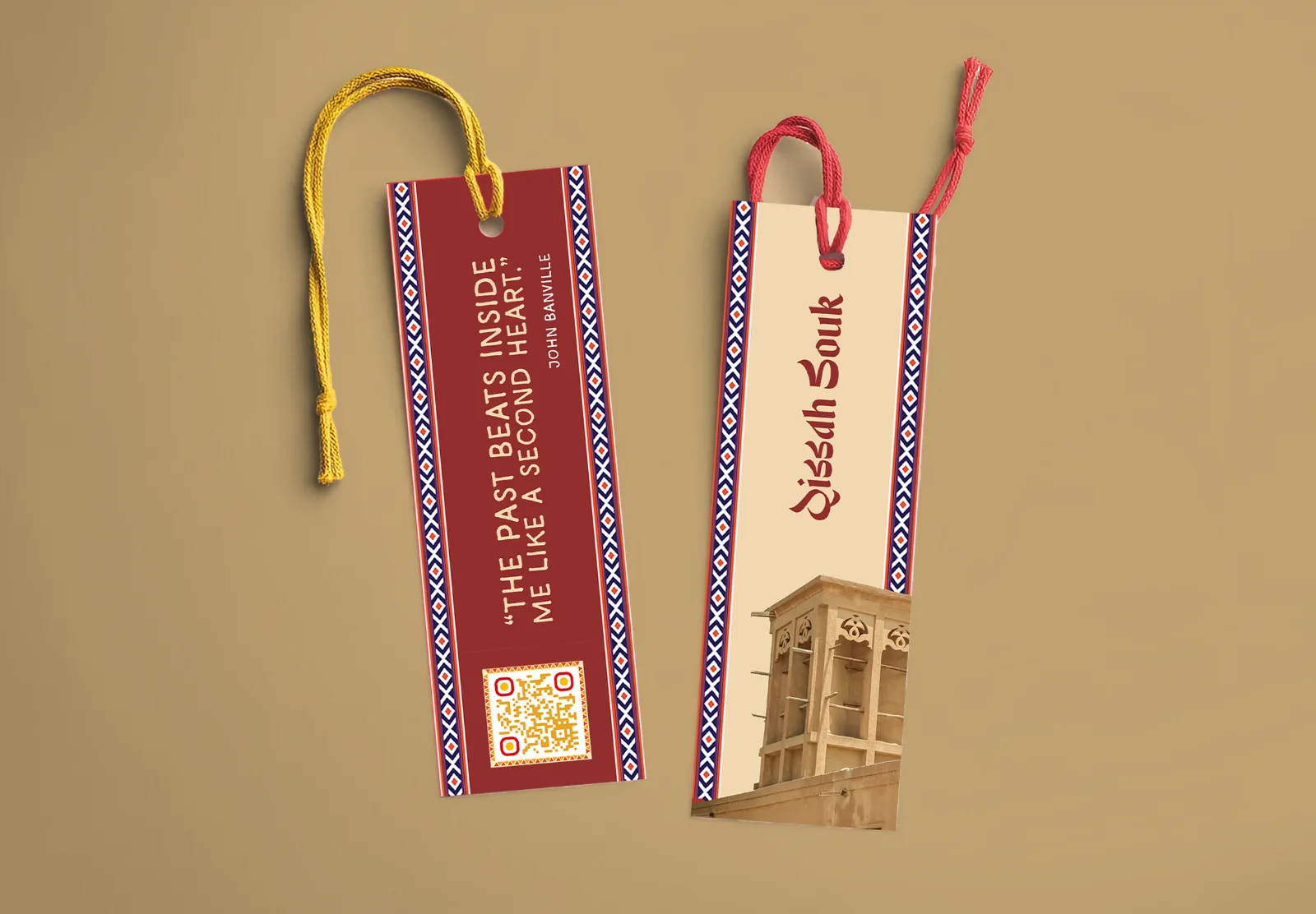
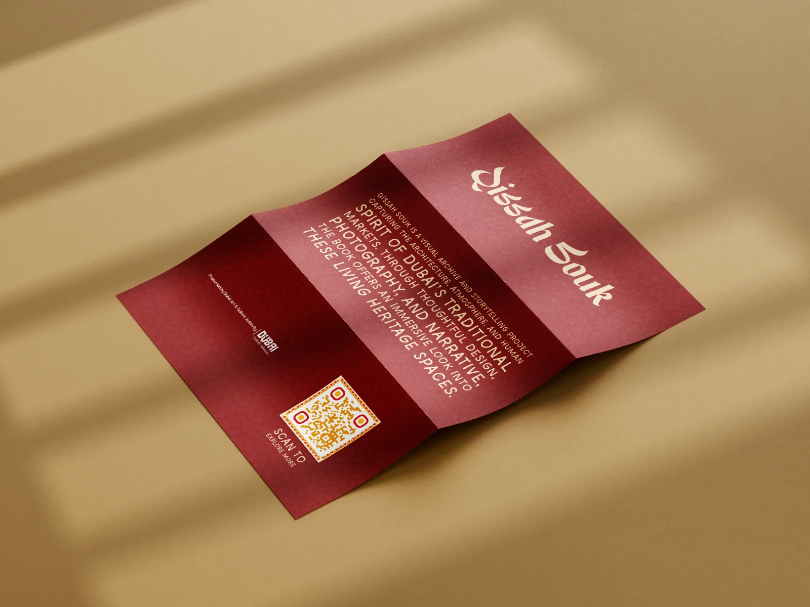
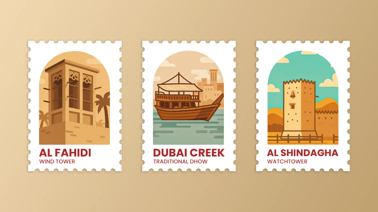
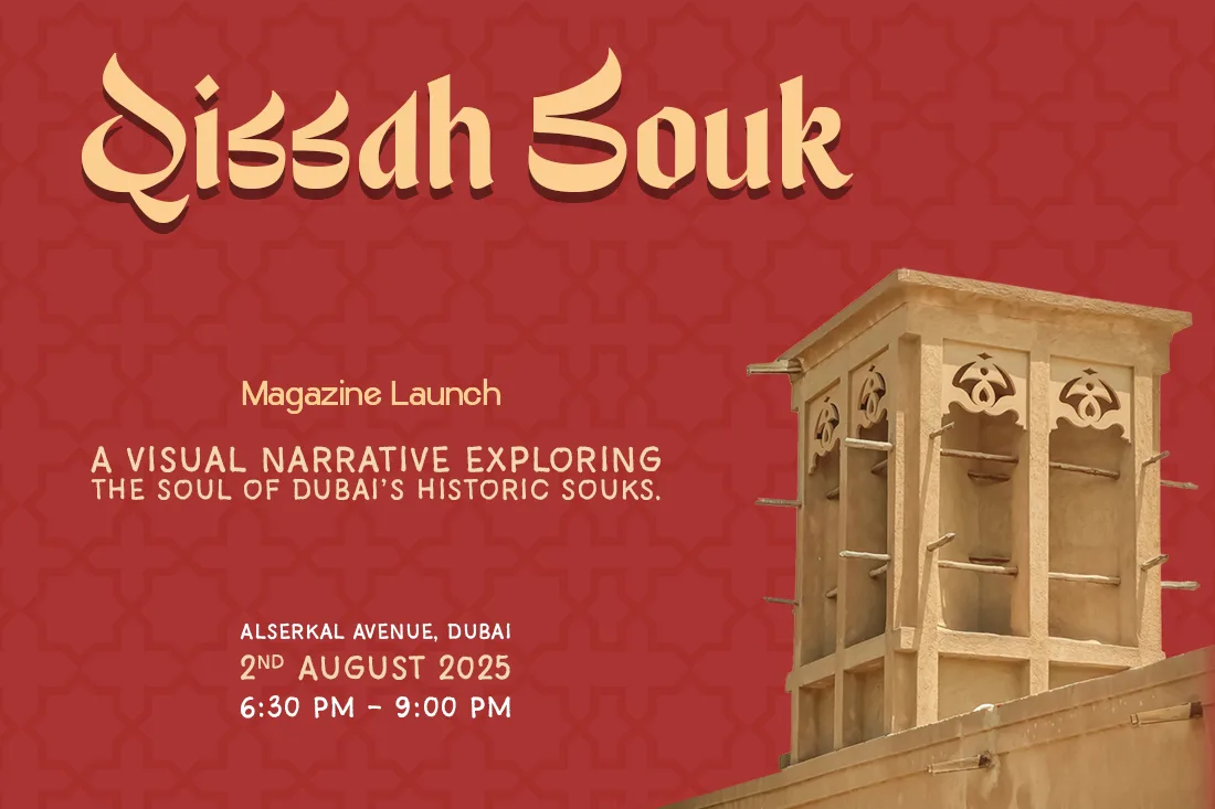
The collateral was designed as a launch campaign rather than a mockup set. Two posters take opposite positions: one desaturates the architecture to a near-monochrome and lets a single woven textile carry the colour, the other goes full crimson and puts the object itself in frame. Small print, bookmarks, a folded map of the three souks and a stamp sheet, gives the project something to leave behind.

Launch poster, monochrome
A1 launch poster · architecture
Launch poster, crimson
A1 launch poster · object
Teaser poster
Teaser poster
Bookmarks
Bookmarks · lattice border, QR to the site
Folded map flyer
Three-fold map of the souk district
Stamp sheet
Commemorative stamp sheet
07

Digital

The QR had to lead somewhere.

Every printed piece carries a code, so the site was built as the campaign's landing point: a scrolling preview of the book, the three souks as chapters, and details on the launch. It borrows the book's rhythm rather than restating it. Full-bleed image, flat colour, annotation.

Qissah Souk website
Landing page
08

Outcome

Exhibition stand
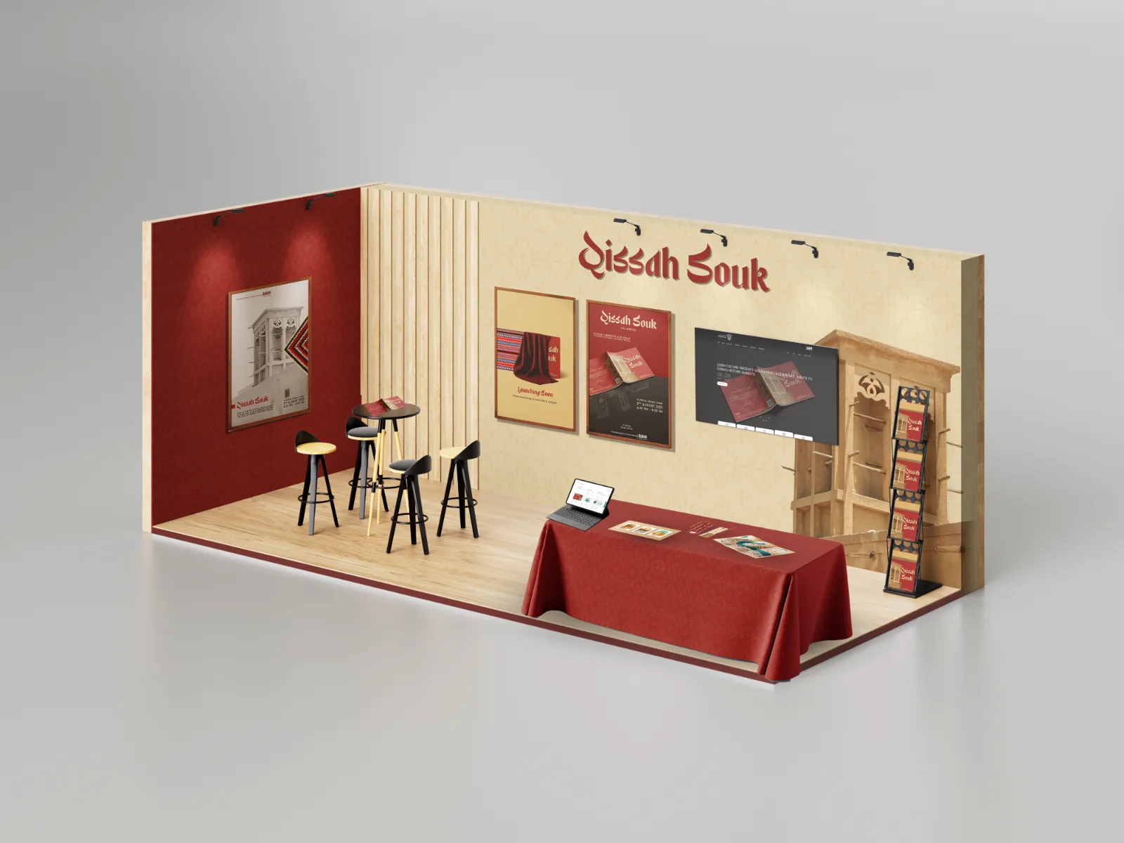
Exhibition stand · Alserkal Avenue, Dubai

Shown at Alserkal Avenue, August 2025.

The project closed with a launch and exhibition: the book on a plinth, the poster series at scale, the stamp sheet and map free to take. The stand was designed as an extension of a spread. Crimson field, lattice screen, a single photograph at architectural scale.

What I would carry forward is the annotation rule. Refusing to include a photograph I couldn't explain forced the research and the edit to move together, and it is the reason the book reads as a record rather than a mood board. The obvious next step is a bilingual edition, with the Arabic setting given the same attention the English got.

Qissah Souk

Design & photography

Emaan Ahmad

Type

Display calligraphic latin with humanist sans text

Print

210 × 210 mm, perfect bound, uncoated stock

Year

2025

Self-initiated project. Institutional marks shown are conceptual.

Worn palms of child labourers, campaign key visual
← Back to work Social impact / Campaign design
Nothing about us, without us

Lost Innocence Chronicles

A child labour awareness campaign carried from research to final artwork by one person: the field work, the photography, the grading, the writing and every piece of graphic design.

RoleResearch, photography, retouching, copy, graphic design
ContextUniversity project, self initiated, built around a Group Development Pakistan awareness brief
Output6 posters, road hoarding, landing page, social set, volunteer kit
Field workTwo cities, three shoot days, November 2023
01 Project overview

A childhood, priced and paid out

The short version. In repair shops and roadside kitchens, children work where children should be playing. I spent three days photographing that with permission, then built a campaign that refuses to make it beautiful.

The line that holds the system together, Nothing about us, without us, appears on every piece from the hoarding down to a cap brim. It is the ethical position and the layout rule at the same time: the child is always the largest thing in the frame, the organisation signs quietly in a corner.

Objective

Move child labour from statistic to face, and give the viewer one action instead of a feeling.

Audience

Commuters and shopkeepers who pass working children daily, students on social, and the partners who fund enforcement.

Concept in one line

The photograph stays silent in black and white. Only the words are allowed colour.

02 The problem in numbers

Research came before the camera

Before any shoot I read the provincial child labour surveys to find out what I was actually looking at. Two findings shaped the whole campaign.

First, the numbers are so large that they stop meaning anything, which is exactly why the campaign leans on one face at a time. Second, most of these children are not in school, so the loss is not only physical, it is a future being closed.

3.8Mchildren aged 5 to 14 in child labour in Punjab, 13.4% of that age groupPunjab Child Labour Survey 2019 to 2020
42%of children in child labour in Punjab reported a work related injury or illnessNCHR and UNICEF review of provincial surveys
41%school attendance among working children, against 71% of children who do not workSindh Child Labour Survey 2022 to 2024
138Mchildren in child labour worldwide, roughly 1 in 12 of all childrenILO and UNICEF global estimates, 2024

Figures are quoted from published survey summaries and used in the campaign only as context. No child photographed here is presented as a statistic or named.

03 Getting access

The hardest part was not the design

Photographing working children is not a matter of lifting a camera. In most shops the owner reads a lens as an accusation, and reacting badly is the safe option for him. Twice I was told to leave. Once it turned tense enough that I put the camera away and walked.

So I stopped shooting where I lived and travelled between cities to find places where I could ask properly, explain the project, and be given a yes I could trust. Three usable shoot days came out of far more days of asking.

Permission first

Every frame here was taken after asking the owner and the child, in that order, and after saying plainly what the pictures were for.

Risk managed

No hidden shooting, no arguing back, no frame worth a child getting shouted at after I left. When a place said no, that place stayed unphotographed.

Travel as method

Moving between cities was not for variety. It was the only way to reach shops where a student with a camera was not read as a threat.

04 Concept and art direction

Silence in the picture, colour in the words

Colour photography of poverty slides quickly into spectacle. Stripping it out buys credibility and hands the only bright thing in the frame to the sentence that makes the accusation.

Tone

Grave, never gruesome

No blood, no bruises, no pity close ups. The weight comes from stillness and eye contact. Dignity is the strategy, not the constraint.

Voice

Written as us, not about them

Headlines name what was taken. The tagline speaks in the first person plural, so the campaign asks on behalf of the children rather than over them.

Craft

One surface, no boxes

Type sits inside the photograph's own darkness. No panels, no scrims, no strokes. The composition has to earn the room for its words.

Ink#050505 canvas and bleed
Signal red#E10600 the spoken word
Bone#F2F0ED headline and logo
Cold shadowBlue grey grade in the blacks
05 Photography and editing

Graded until the frame dissolves into the page

Everything was shot handheld, in the light that was there, in colour. The grade then pushes each image toward one target: blacks that match the poster's black exactly, so the photograph has no visible edge.

The child appears to come out of the paper rather than sit on top of a rectangle, and the headline can stand in the same darkness as the room.

Contact sheet, unretouched Repair strip and roadside kitchen, November 2023
Unretouched frame, roadside kitchen Unretouched frame, roadside kitchen Unretouched frame, roadside kitchen Unretouched frame, roadside kitchen Unretouched frame, roadside kitchen Unretouched frame, repair strip Unretouched frame, repair strip Unretouched frame, repair strip Unretouched frame, repair strip Unretouched portrait, repair strip Unretouched portrait, repair strip

Kept here uncropped and unedited so the distance between what the camera recorded and what the poster argues stays visible. This is also the honest record of how little the shoot was staged.

Graded triptych, left panel Graded triptych, centre panel Graded triptych, right panel

One image, three panels
The key visual is a single graded photograph, cut into three and read left to right like a sentence.

Contrast
An S curve holds detail in the palm lines and crushes everything past the wrist to pure black.

Mood
Cool blue grey shadows keep the low key from turning sentimental or sepia warm.

Desaturation, not a filter

Colour is removed channel by channel with skin held slightly brighter than the environment, so faces keep separation from rust, cloth and soot.

Dodge the gaze

Eyes and palms are lifted about half a stop and everything else burned down, so the brightest value in the frame is the thing the campaign is arguing about.

Matching the black point

Shadow output is pulled down to the poster background value so image and canvas fuse. No frames, no drop shadows, no visible photo edge anywhere in the campaign.

Texture into type

A plate of the same photograph is masked inside the headline letters, so the words are literally made of the room the child works in.

06 Posters and banner

Four photographs, one accusation

Poster: Rusty Dreams, Silent Tears
Rust / A2 and feed 4:5

Rusty Dreams,
Silent Tears

A boy at a repair bench turns to camera mid task. The headline runs across the top third, where the workshop falls away into black, so type occupies space the photograph has already given up.

Rust is both the metaphor and the word: a childhood corroding in place.

Poster: Playful Whirs Silenced
Silence / A2 and feed 4:5

Playful Whirs
Silenced

The most direct portrait of the set. The child looks up from floor level and the viewer looks down. The headline stacks into the upper right and the last word is dimmed almost to the background, so the type performs the silence it describes.

Poster: Tiny Hands, Heavy World
Key visual / A2

Tiny Hands,
Heavy World

Open palms shot from above, ambiguous between offering and asking. No faces, which is why it scales: it became the web hero and the most shared image of the set.

Centred type and a centred logo make this the only symmetrical composition, giving the series a still point.

Poster: Stolen Childhood
Summary line / A2 and feed 4:5

Stolen
Childhood

The closest crop and the shortest headline. Type is anchored bottom left so the face holds the upper two thirds unchallenged. The words arrive after the eye contact, not before it.

This became the campaign's summary line and carried over word for word to the hoarding and the website.

The typographic edition

A second family runs with no photograph at all. Where the documentary posters need a face to earn attention, these need only two voices: a condensed red shout and a soft rounded whisper. They exist for placements where an image would be too small to read, and they carry the campaign at any size.

Typographic poster: tiny HANDS HEAVY world
Type only / A3 portrait

Tiny Hands,
Heavy World

Two typefaces argue in the same space. HANDS and HEAVY are set enormous in flat red caps, while tiny and world are small and rounded and tuck into the gaps of the big letters.

The adjectives are physically overpowered by the nouns, so the layout says what the sentence says. Nothing sits politely in its own box.

Typographic banner, two to one ratio
Banner 2:1 / web and out of home

The same words, one line

The landscape cut collapses the stack into a single line so the phrase can be read in one pass at speed. The collision is now horizontal: HANDS runs straight into HEAVY with no space between them.

Tagline and logo drop to the lower band, centred, at roughly a fifth of the headline size. The same ratio as every other piece.

Out of home Hoarding, arterial road placement
Campaign hoarding on an arterial road

At hoarding scale the composition inverts. The portrait moves left, the headline takes the open half, and the copy is cut to four words so it can be read at speed. Against a bright sky the black field reads as a hole in the street.

Digital Campaign landing page
Campaign landing page hero

The key visual runs full bleed behind the fold with the headline set bottom left, the same anchor as the Stolen Childhood poster, so a viewer who saw the street already knows the page.

One action, one button: Support Change, on the campaign's only white surface. Nothing else on the screen is allowed to be that bright.

Collateral Volunteer kit
Volunteer cap with campaign tagline Volunteer shirt with organisation lock up

On the volunteer kit the imagery drops away entirely and only the tagline survives. Worn on the ground the wearer is the photograph, so the garment only has to name the promise.

07 The system

Six rules, every piece

01

The photograph never carries colour. Every image is monochrome with cold shadows. Saturation is a privilege of type alone.

02

Red marks the loss, once. One or two words per piece, never more than a tenth of the surface, never on a face.

03

Headlines are condensed caps. One family, one weight, tight tracking, no italics and no second display face anywhere.

04

The tagline appears on every piece. Same words, same humanist sans, always subordinate to the headline and never coloured.

05

The logo signs, it does not lead. White lock up, one corner, about a fifth of the headline size. The child is always larger than the organisation.

06

Type lives where the photo goes black. No boxes, no scrims, no strokes. The composition earns its own space for words.

Display, condensed gothic Stolen Childhood
Caps onlyTight trackingLeading under 1
Support, humanist sans Nothing about us, without us

Used for taglines, body copy, captions and web interface. Sentence case wherever the campaign wants to sound like a person rather than a poster.

The campaign at a glance
Rusty Dreams poster Playful Whirs Silenced poster Tiny Hands Heavy World poster Stolen Childhood poster Typographic poster Typographic banner Road hoarding Landing page
08 Reflection
The campaign is not asking to be looked at. It is asking to be answered.

Every choice here was made to produce a two second delay: the pause between seeing a child's face and remembering the one you walked past this morning. Monochrome earns the trust, red delivers the sentence, and the tagline hands the argument back to the child.

Carrying the whole thing myself, from the research and the asking to the grade, the type and the layout, is what kept the system this tight. Nothing had to be redesigned between a hoarding and a cap brim, only rescaled.

What I would do differently

Budget twice the time for access. The design was never the bottleneck, permission was.

What I learned

A campaign about people you cannot photograph safely has to be designed around that limit, not in spite of it.

Why it stays with me

It began as coursework and ended as the work I show first. The children in it were generous with something they were not asked to give.

Closing image from the key visual
Nothing about us, without us Research, photography, retouching and design by Emaan Ahmad
← Back to work
{{ cs.category }}·{{ cs.year }}

{{ cs.title }}

{{ cs.lead }}

{{ cs.lead2 }}

{{ tg.t }}
{{ cs.title }}
{{ ch.num }} · {{ ch.label }}

{{ ch.head }}

{{ ch.body }}

  • {{ li.t }}
{{ sh.cap }}
{{ sh.cap }}

Got a brand that needs this?

Start a project →
← Back to work

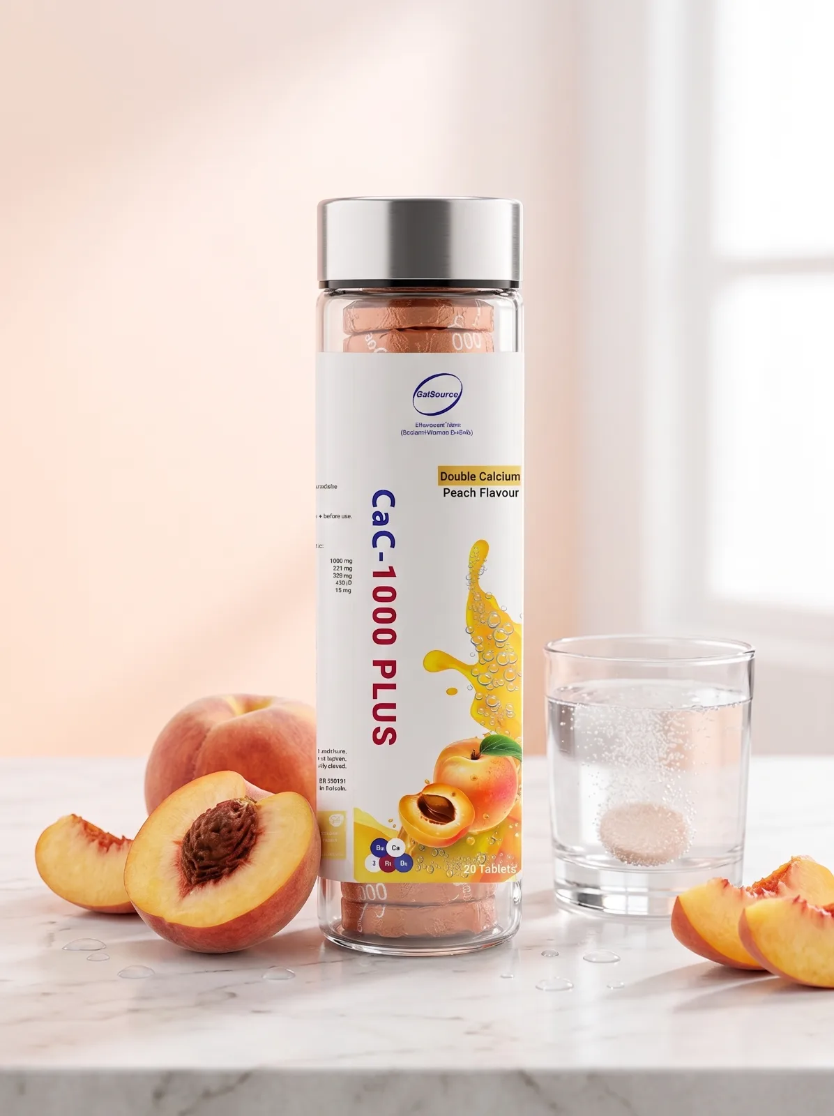
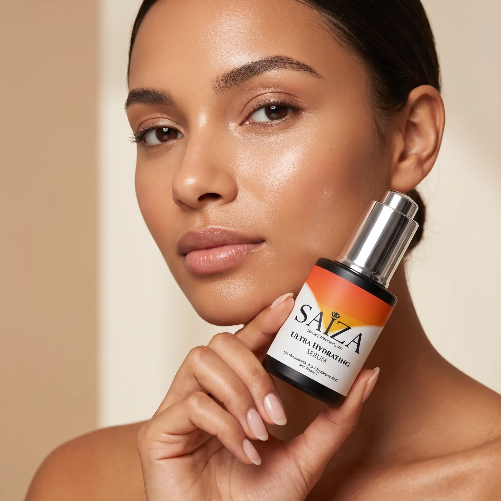
Shelf presence.

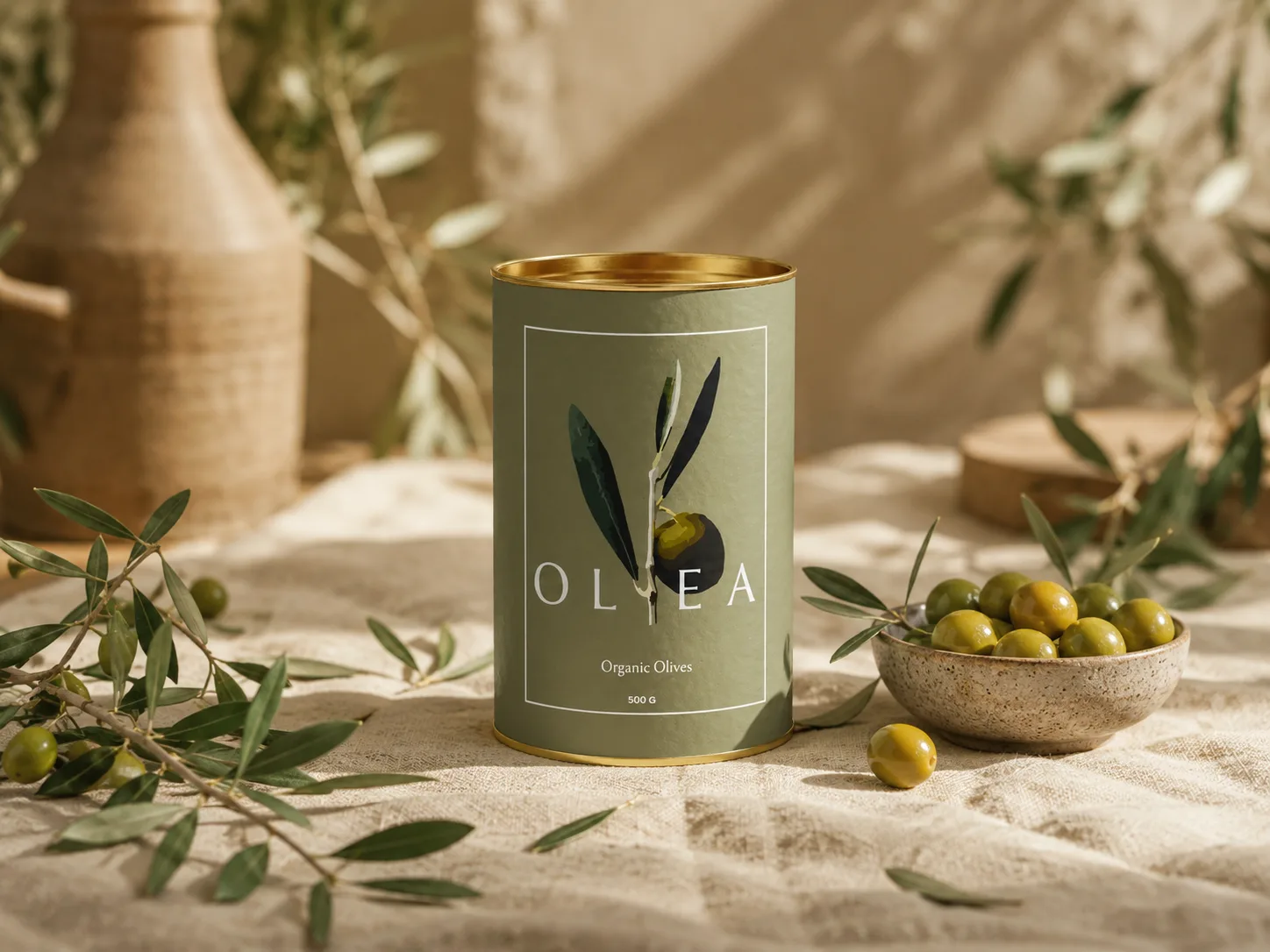
Label and pack design where the brief is simple and brutal: get picked up. Type hierarchy first, ingredient trust second, decoration last.

Saiza serum label
Saiza · Serum Label
CaC-1000 Plus label
CaC-1000 · Bottle Label
Olea olives tin label
Olea · Tin Label
Next: Web & digital →
← Back to work
Web & Digital

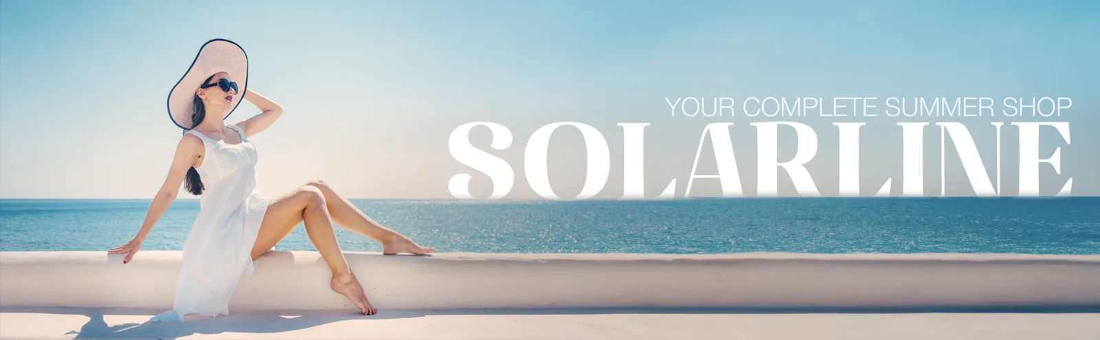
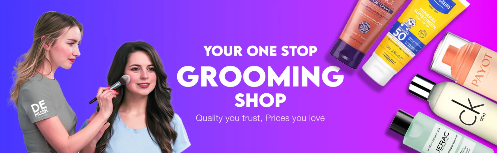
Banners that click.

Campaign and e-commerce graphics built to survive a crowded homepage: one message, one offer, one clear action.

Solarline summer shop banner De Musk savings bundle banner Grooming shop banner
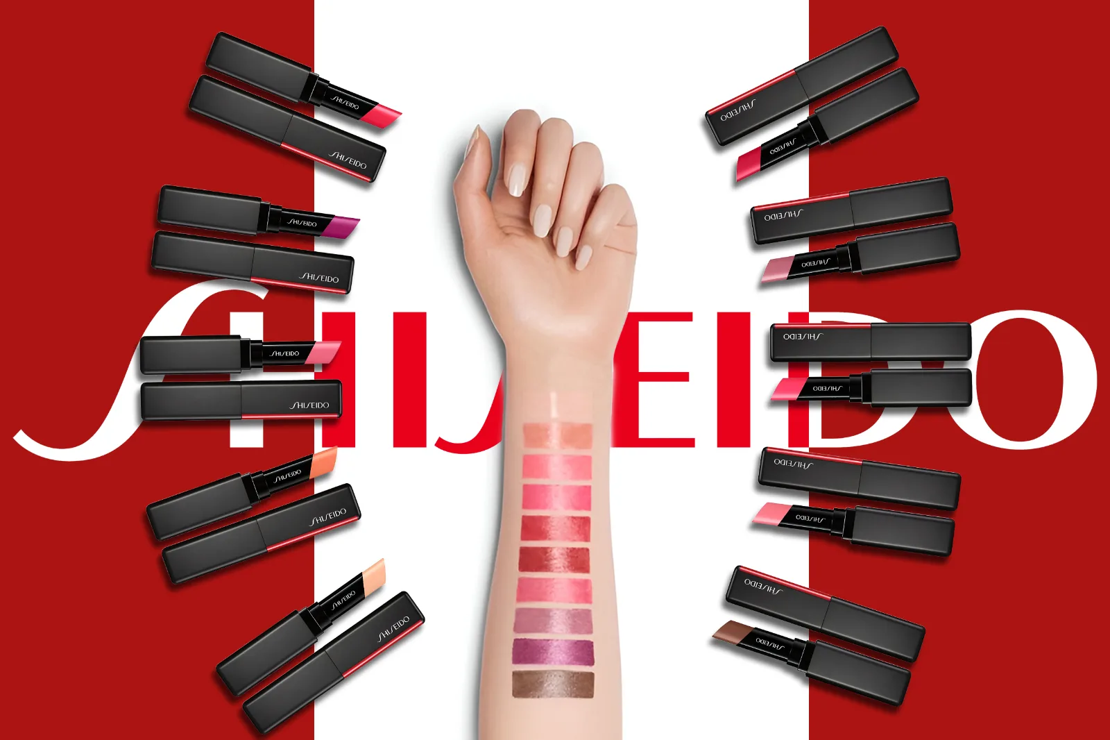
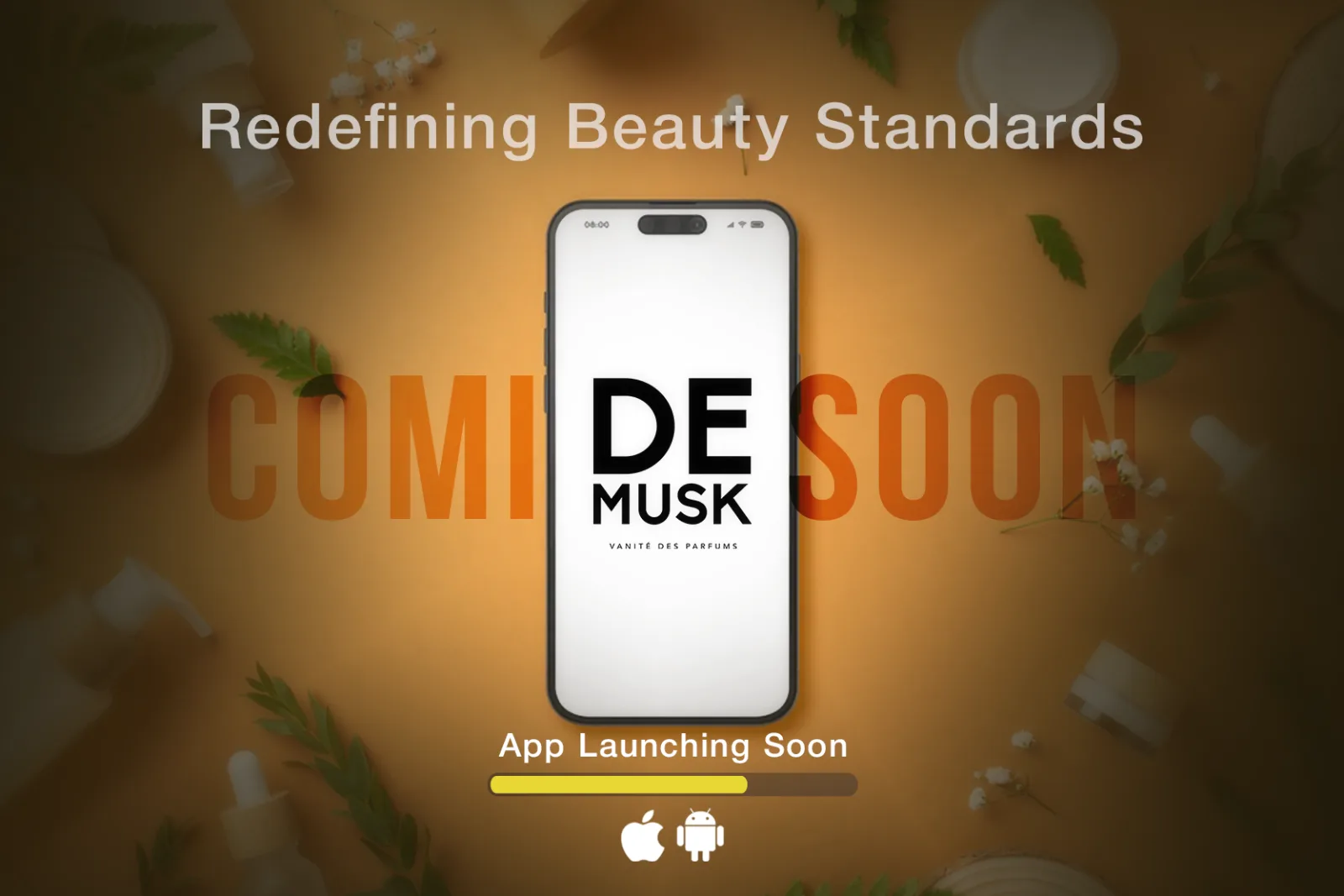
Shiseido lipstick banner De Musk app coming soon banner
What I Do

Services that ship.

Pick one piece or the whole system. Either way you get files that work in print, on shelf and on a phone screen.

{{ s.desc }}

You get
{{ it.t }}
Ask about this →

What working together looks like

1

Enquiry

You send the brief. I reply within 24 hours with scope and price.

2

Direction

Two or three routes to react to, we lock one.

3

Refine

Two rounds of revisions included on every project.

4

Handover

Print-ready exports, source files and usage notes.

Get a quote →
Saved a watermarked copy. For clean files or prints, get in touch.
{{ s.cap }}
Photography
{{ stripCounter }} · {{ stripPlace }} {{ stripCap }}

The habit
of looking

Photography is the part of my practice with no brief. Eighty-nine frames from Dubai and Pakistan, sequenced by the mood they share rather than the day they were taken. It is where my sense of colour, light and cropping actually comes from.

All frames Tap to pin · double-tap to enlarge
{{ ph.cap }}

All photographs © Emaan Ahmad. Prints available on request.

{{ lbCounter }}
{{ lbCap }}
{{ lbCap }}
{{ lbPlace }}
Résumé

Emaan Ahmad

Graphic & Web Designer · Dubai, UAE

↓ Download CV (PDF)

Experience

Graphic Designer
Baoo Jee PMS · On-site · 2 years (current)

Own the brand's visual output end to end: social campaigns, product graphics, promo material and web banners, on a weekly publishing rhythm.

Freelance Designer
Independent clients · 5 years · UAE & Pakistan

Brand identities and packaging for clients including Hummal Elań, Cloud Hub Solutions and Butterly Cookies, plus ongoing social design for F&B, travel, legal and wellness brands.

Selected Projects

Skills

Brand identity & logo systems Packaging & label design Social media & campaign design Marketing collateral Presentation design UI & web layout

Tools

Adobe
Photoshop logoPhotoshop Illustrator logoIllustrator After Effects logoAfter Effects Lightroom logoLightroom InDesign logoInDesign
Also
Figma logoFigma Canva logoCanva
have a project in mind?

Let's create
something great!

Tell me about the project

Thanks, your email is ready to send.

Your mail app should have opened with the details filled in. If it didn't, email me directly at emaanahmadgd@gmail.com.

Sending opens your mail app with everything pre-filled: nothing is stored here.